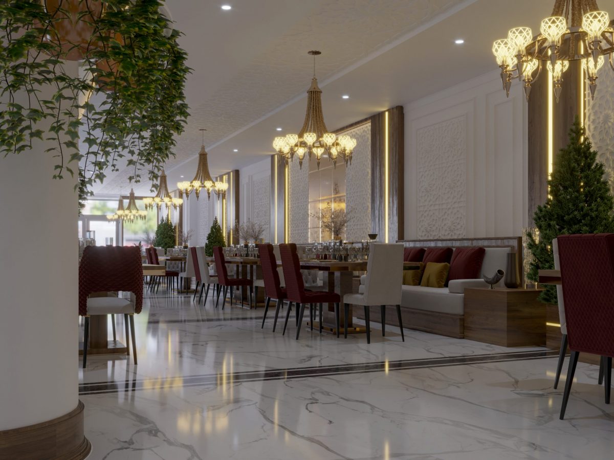
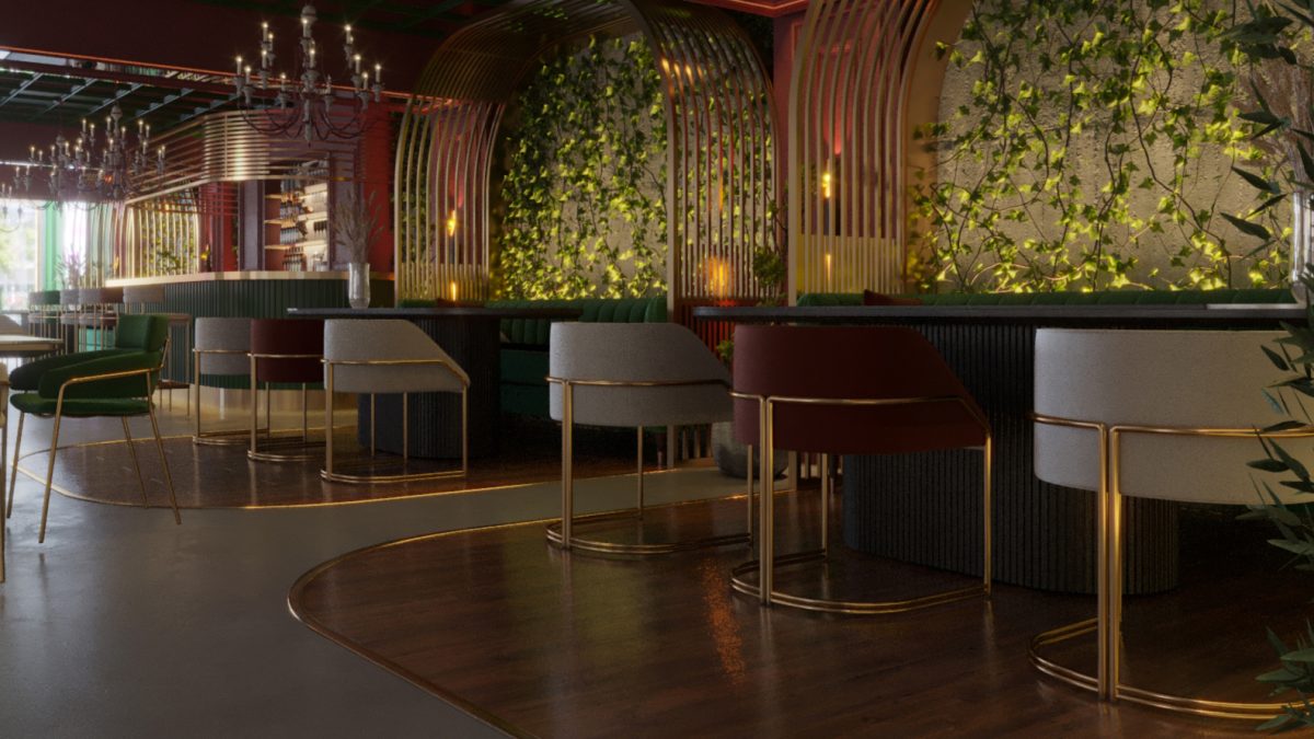
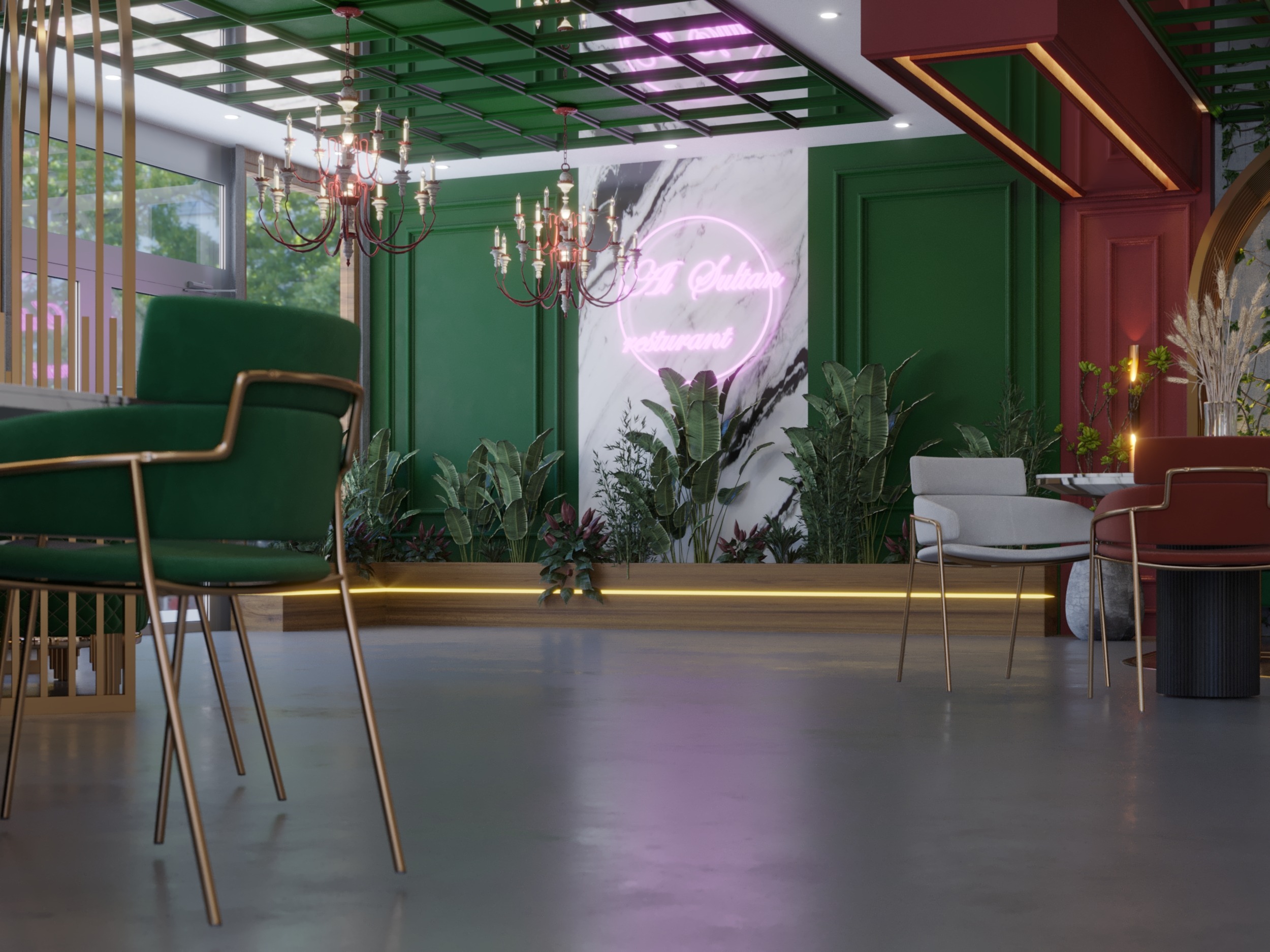
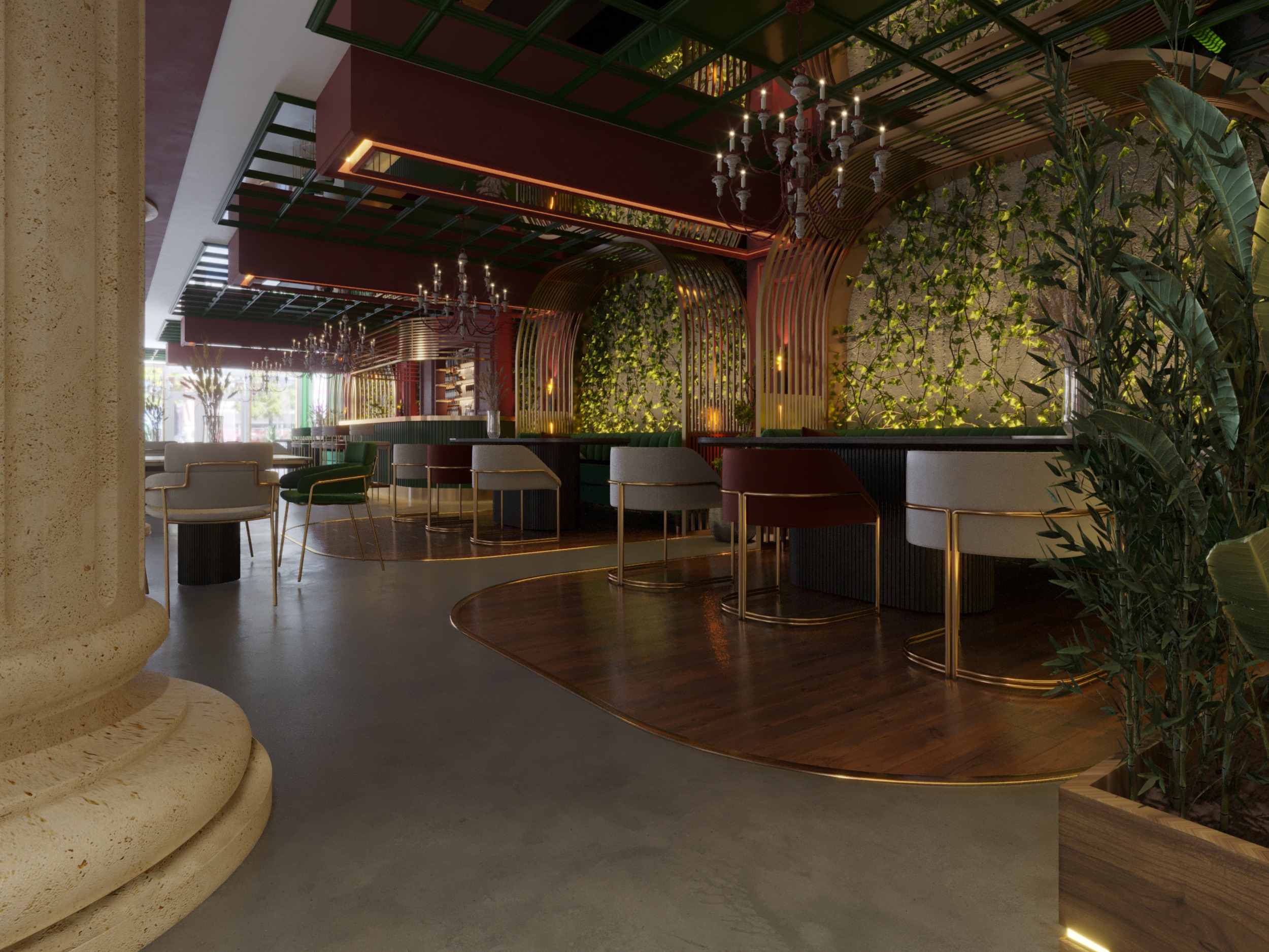
LUXURY RESTAURANT DESIGN BY HRarchZ , RED AND GREEN COLORS USED ALOT
TO MAKE THIS AMAZING COMBINATION , HOW EVER WE MIXED HARD DETAILS FROM THE CLASSIC STYLE AND
THE MODERN STYLE , ALSO WE HISTORICAL PARTS TOO WE WILL EXPLAIN MORE IN THIS ARTICLE .
LUXURY RESTAURANT DESIGN:
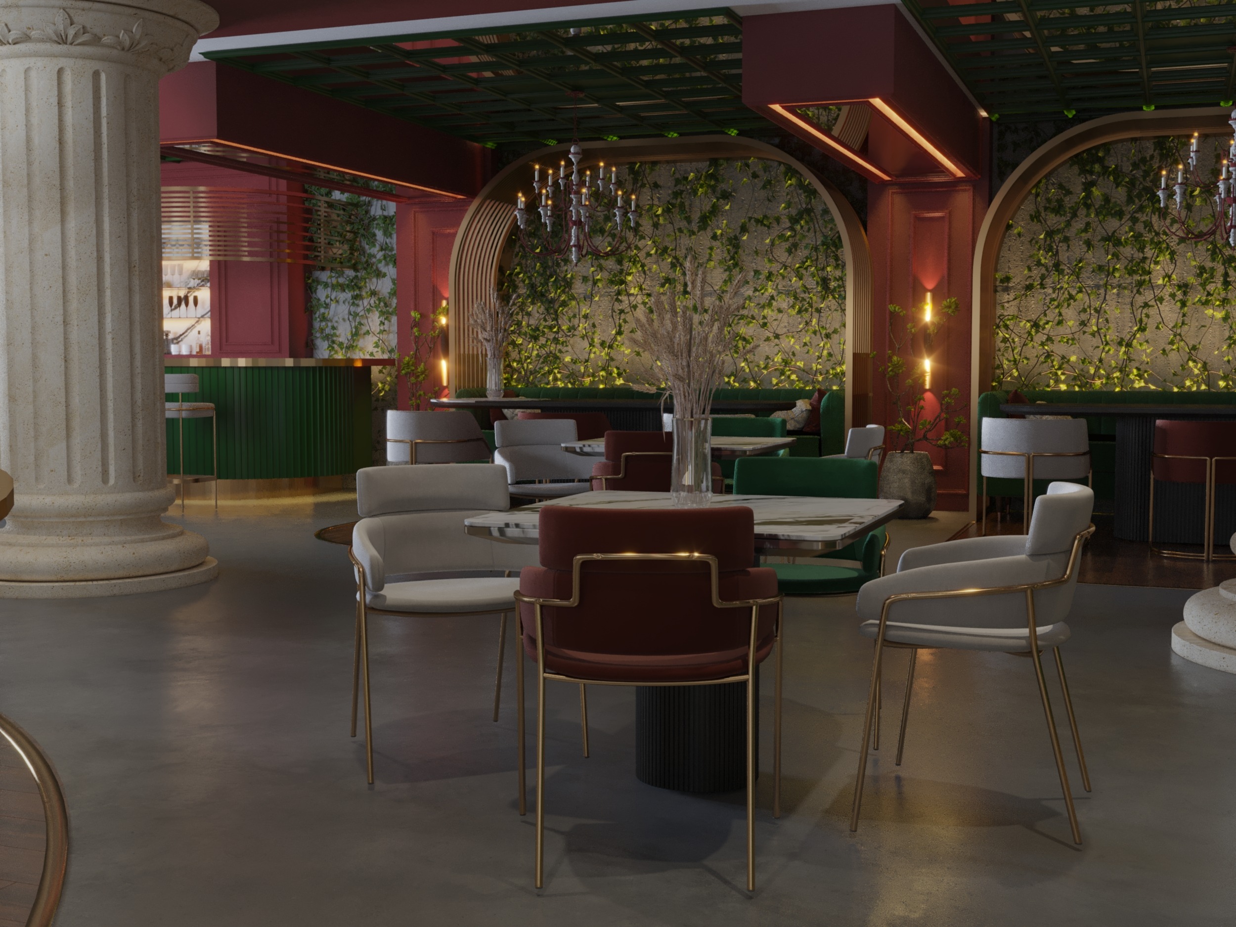
Historical parts used ( columns ) to give stunning soul to the design , also the colors combination used with
the plants and the golden cages in the vip area , also the marble in the x shape next to the water fall , plus the furniture
selected carefully , also the space using was perfect .
LUXURY RESTAURANT DESIGN DETAILS :
- MODERN AND CLASSIC STYLE .
- RESTAURANT DESIGN .
- COLORS ( RED – GREEN – GOLD – WHITE – BLACK – GRAY ).
- MATERIALS ( GOLD METAL – CONCRETE – GYPSUM BOARD – WOOD – PLANTS ).
- THIS DESIGN IN ( KSA : SAUDI ARABIA ).
RENDERS :
Hope you like the following renders :
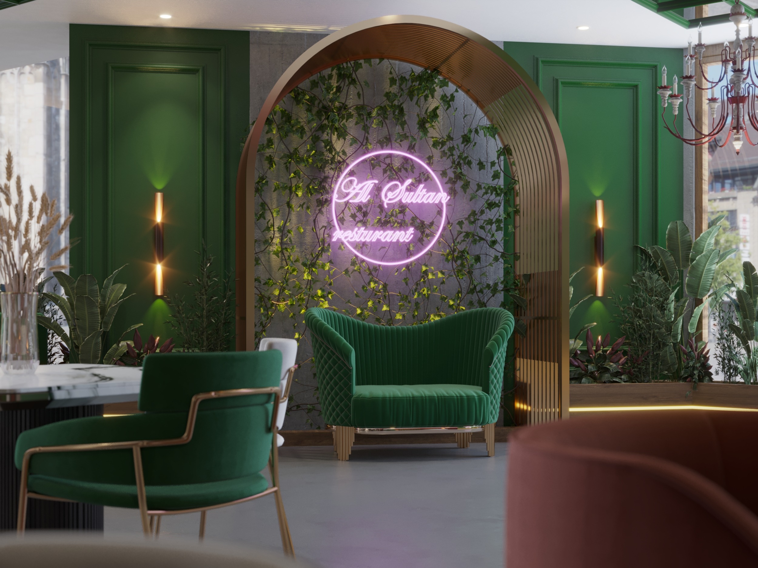
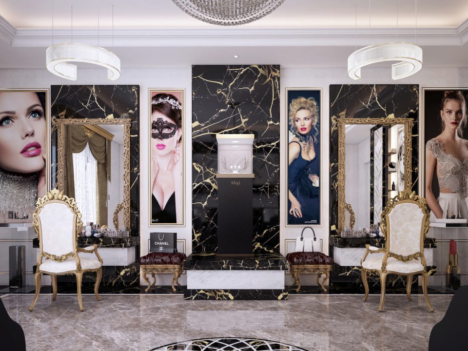
selfie area to take really nice pics , how ever you can see the restaurant logo made of light in purple color .
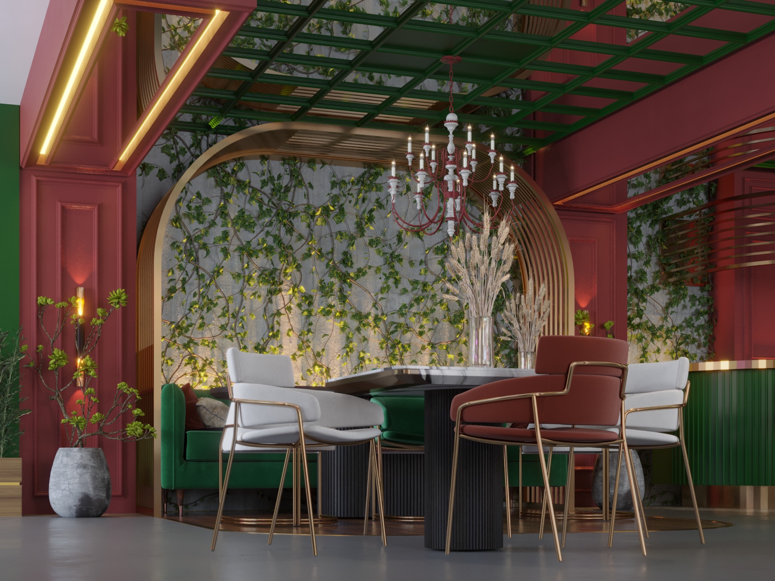
render for the vip unite , however it showing the details in a more clear way , also the golden cage did its part perfectly .
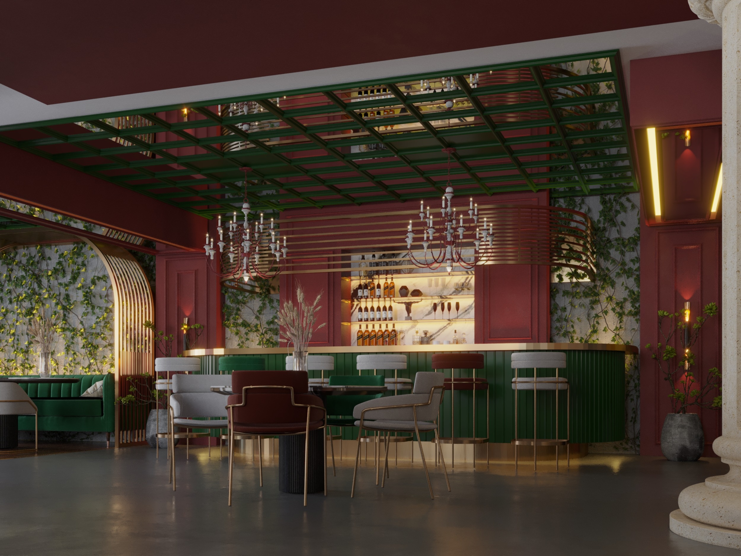
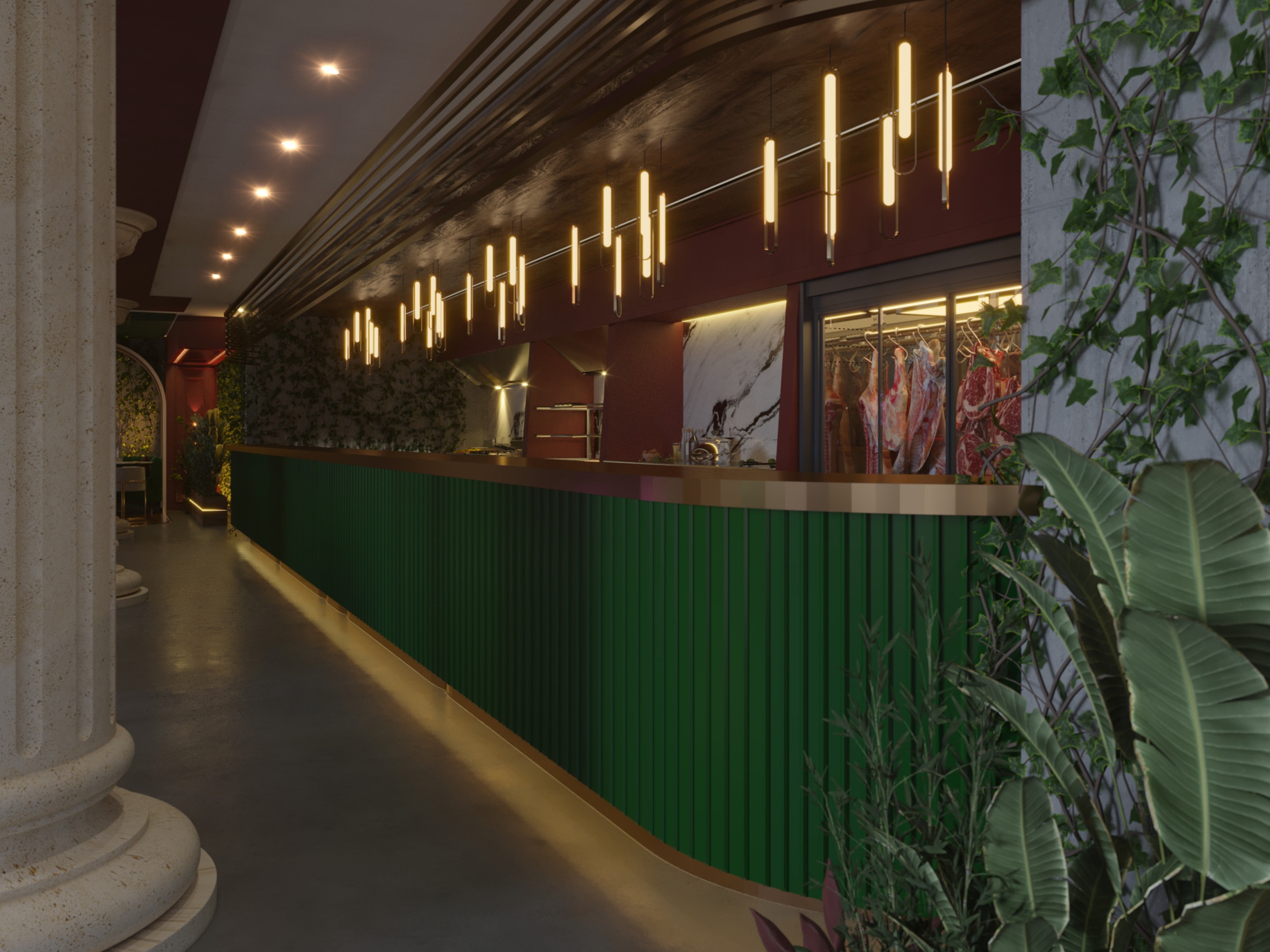
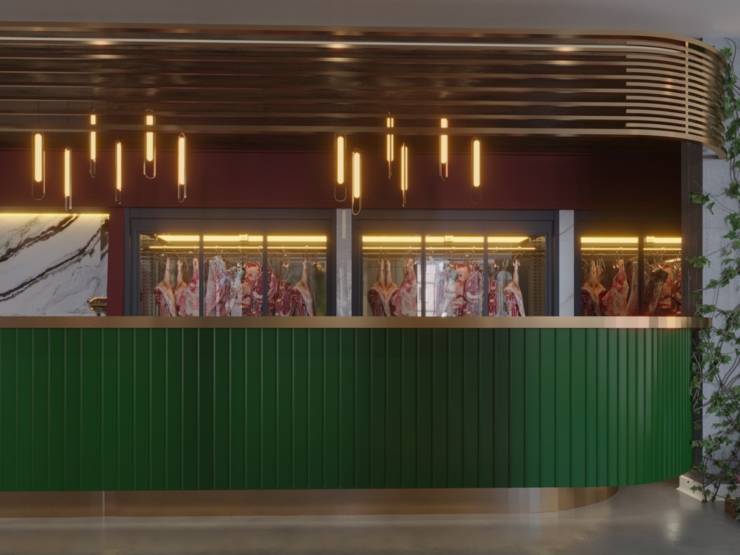
bar design designed in luxurious way , also the classic details in the ceiling with the red and green work in a perfect combination .
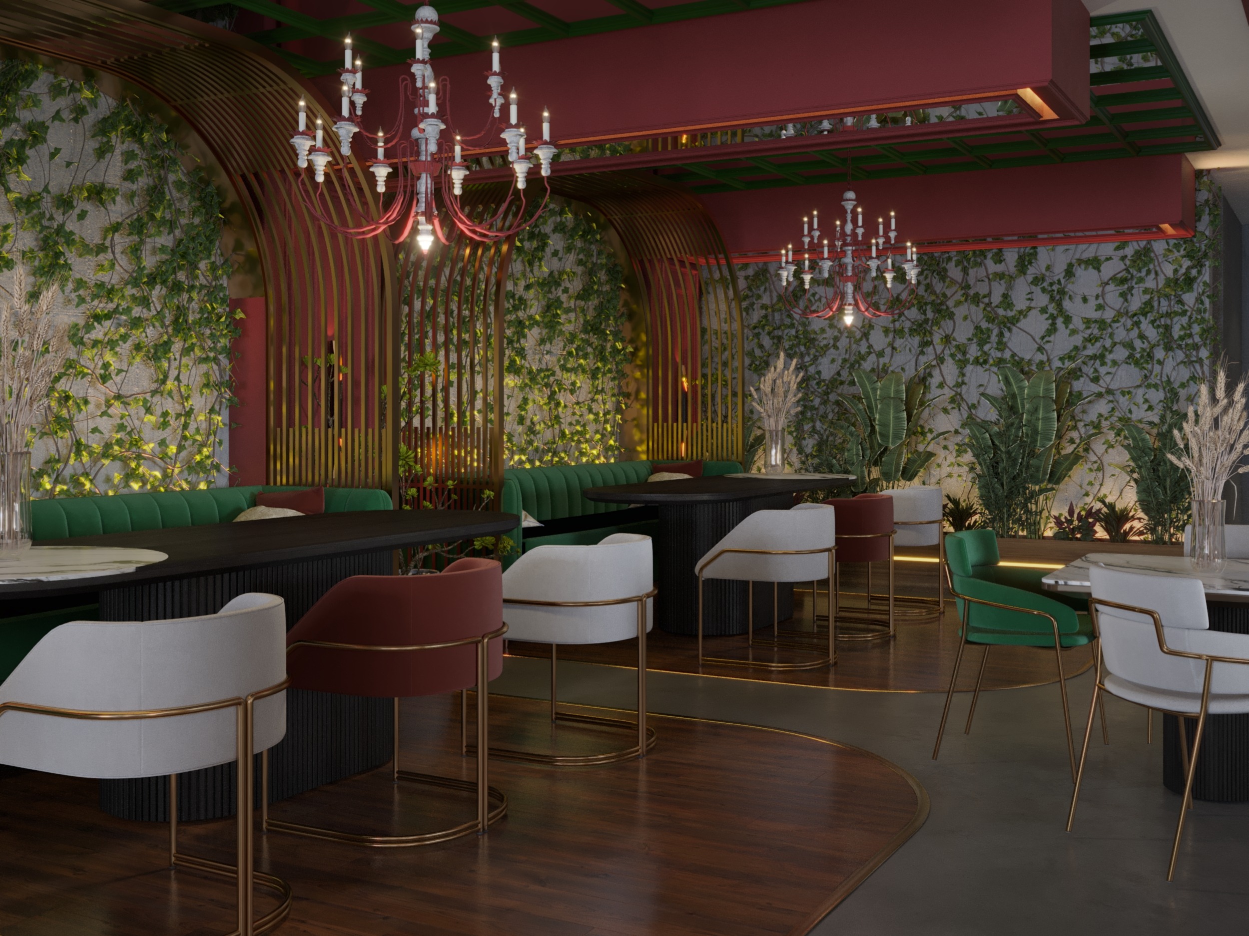
the plants made a major part in this design , however it filled all the part that need to connect the design
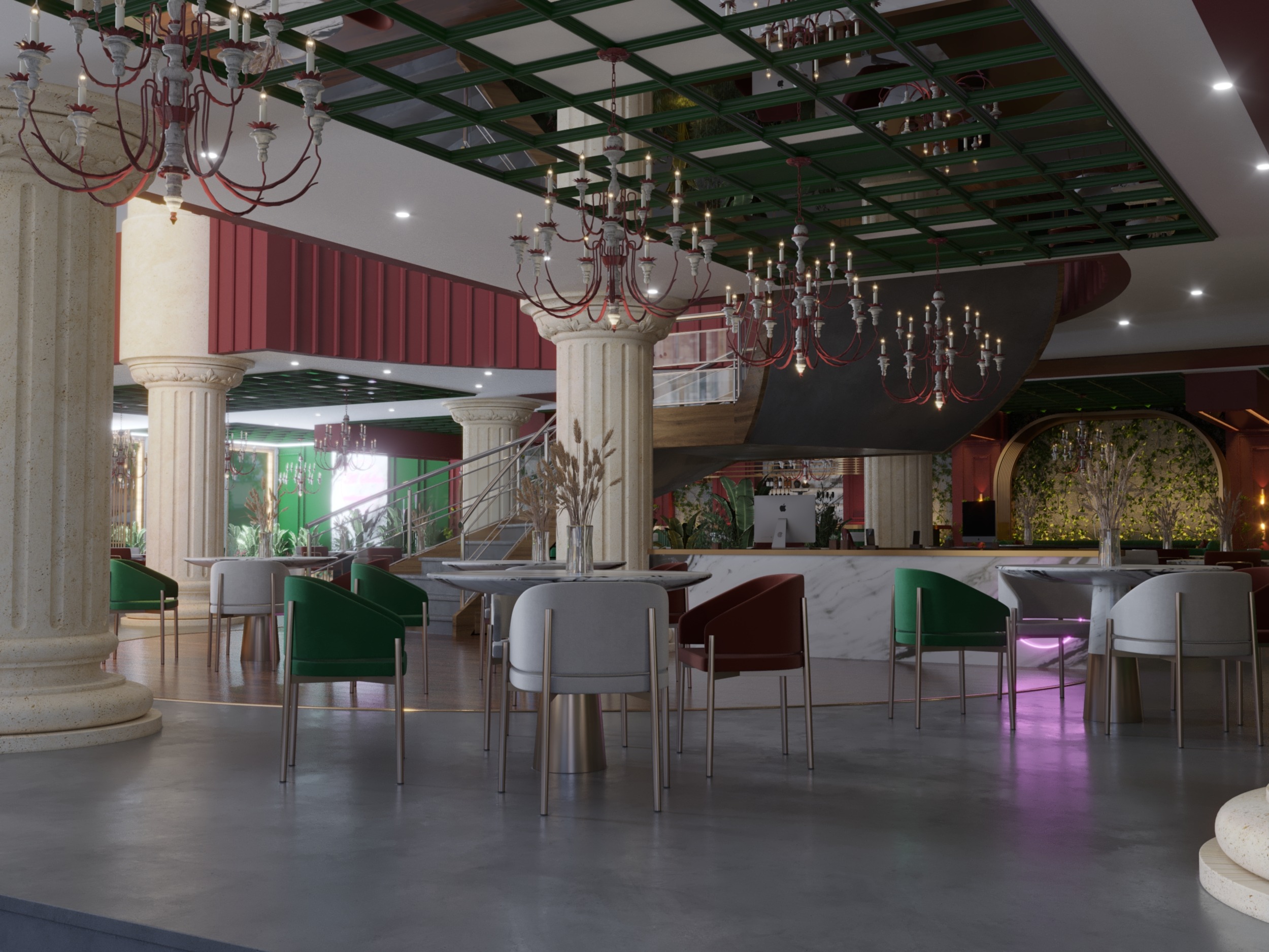
historical columns gave the design beautiful touch , also the chandeliers look amazing and fit the design very well
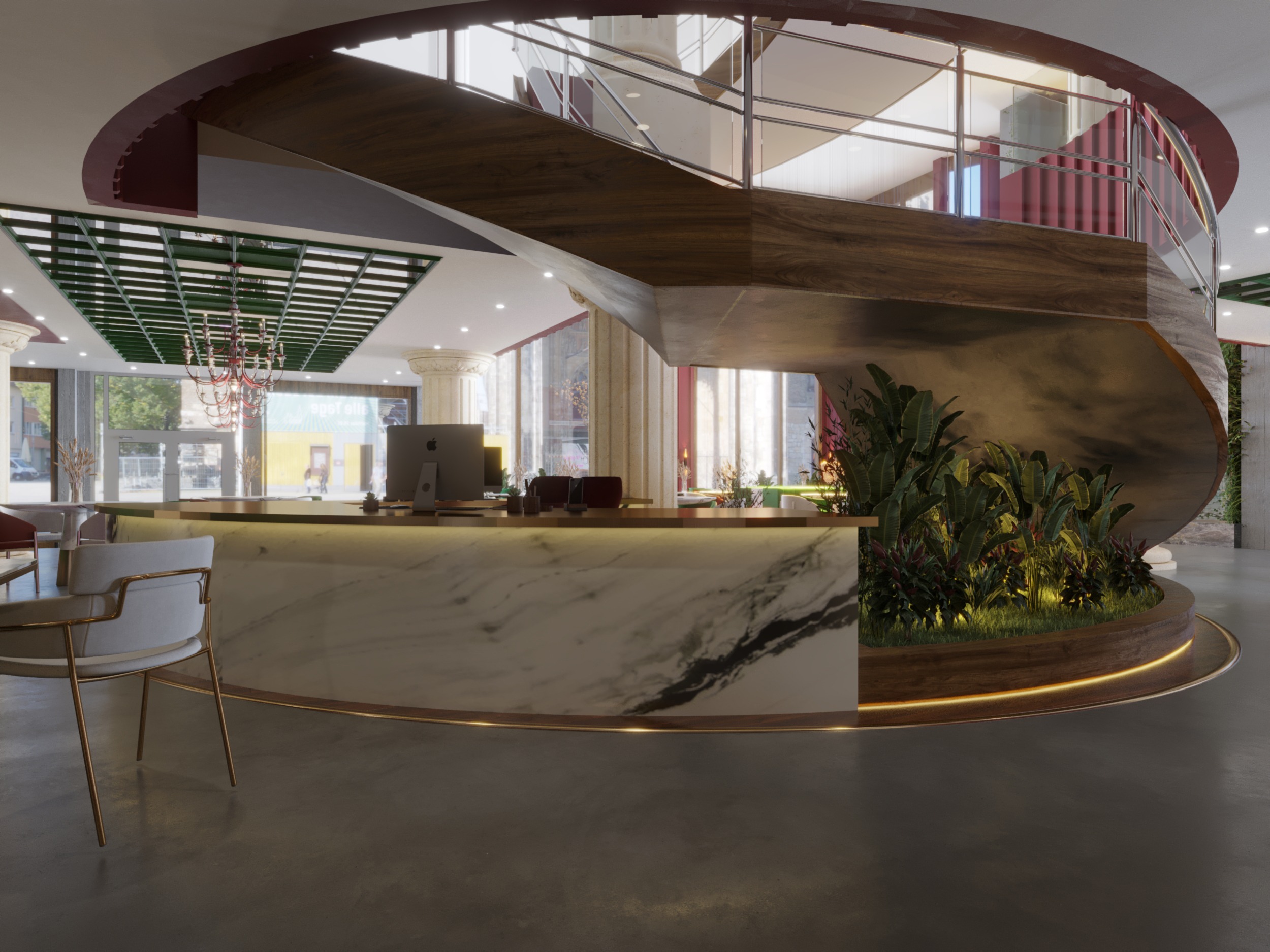
casher marble table with organized plants next to it , also the hidden light gave modern vibes ,how ever its a perfect space use under the stairs .
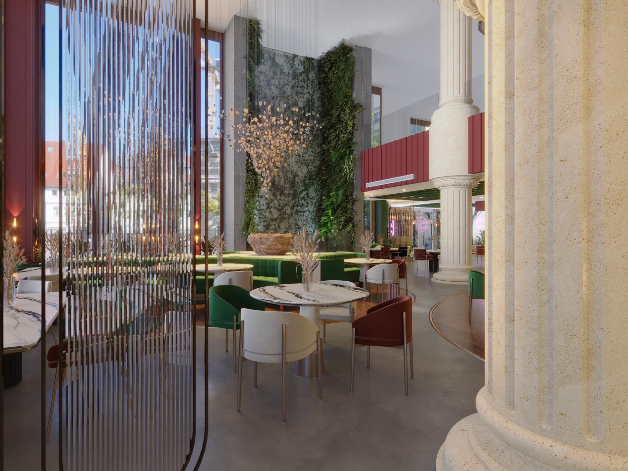
columns gave really amazing touch to the design , plus the water fall the heart of the restaurant look really natural .
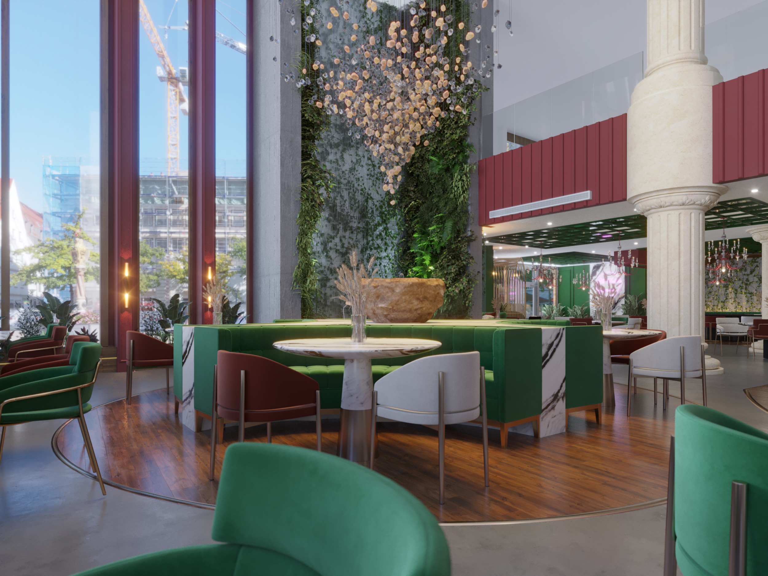
we have big windows in this design ,how ever you can feel the classy touches in this design , also the modern details too .
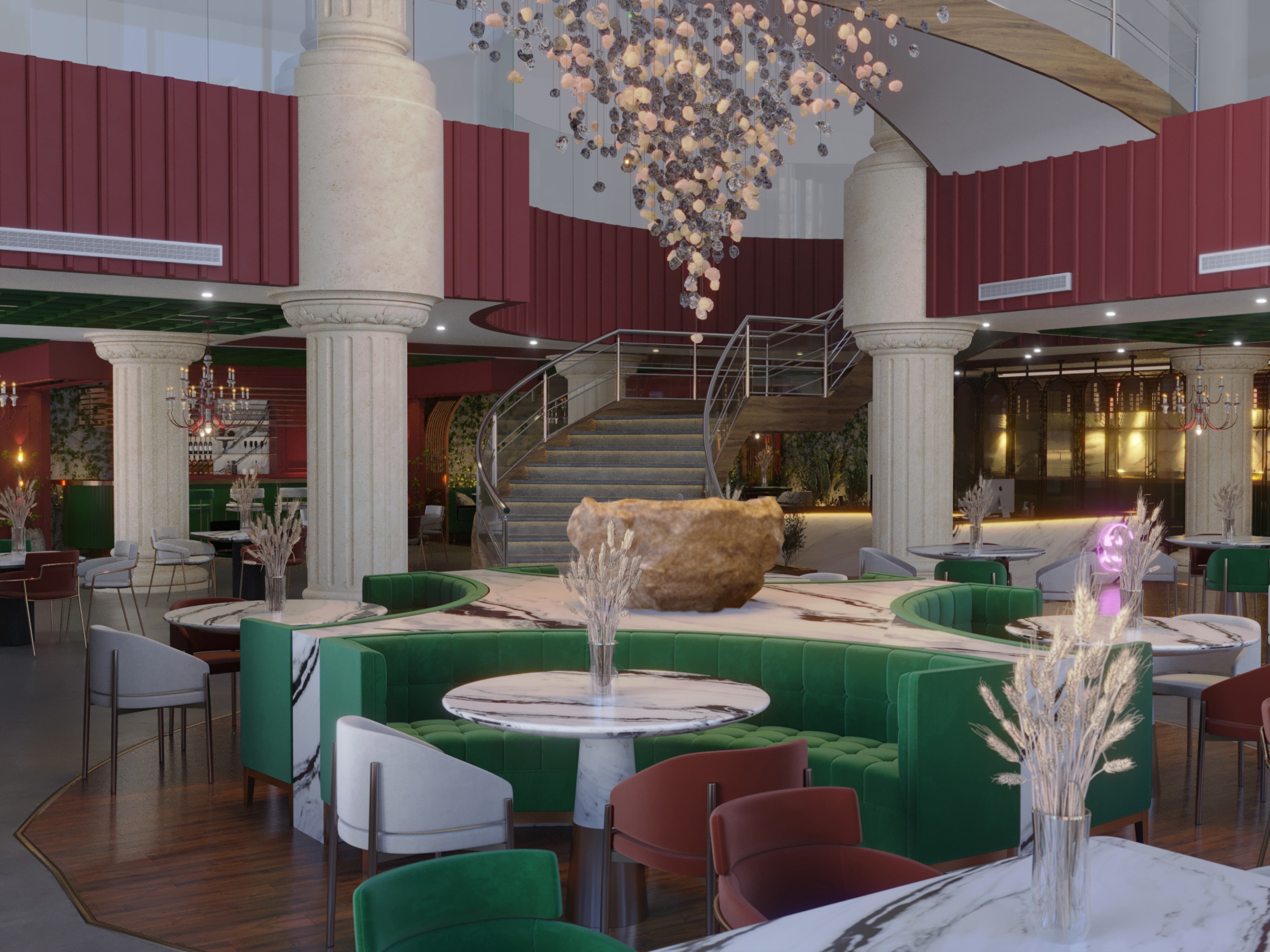
x shape marble surrounded with sofas and chairs , how ever the chandelier design meet with the big rock look epic .
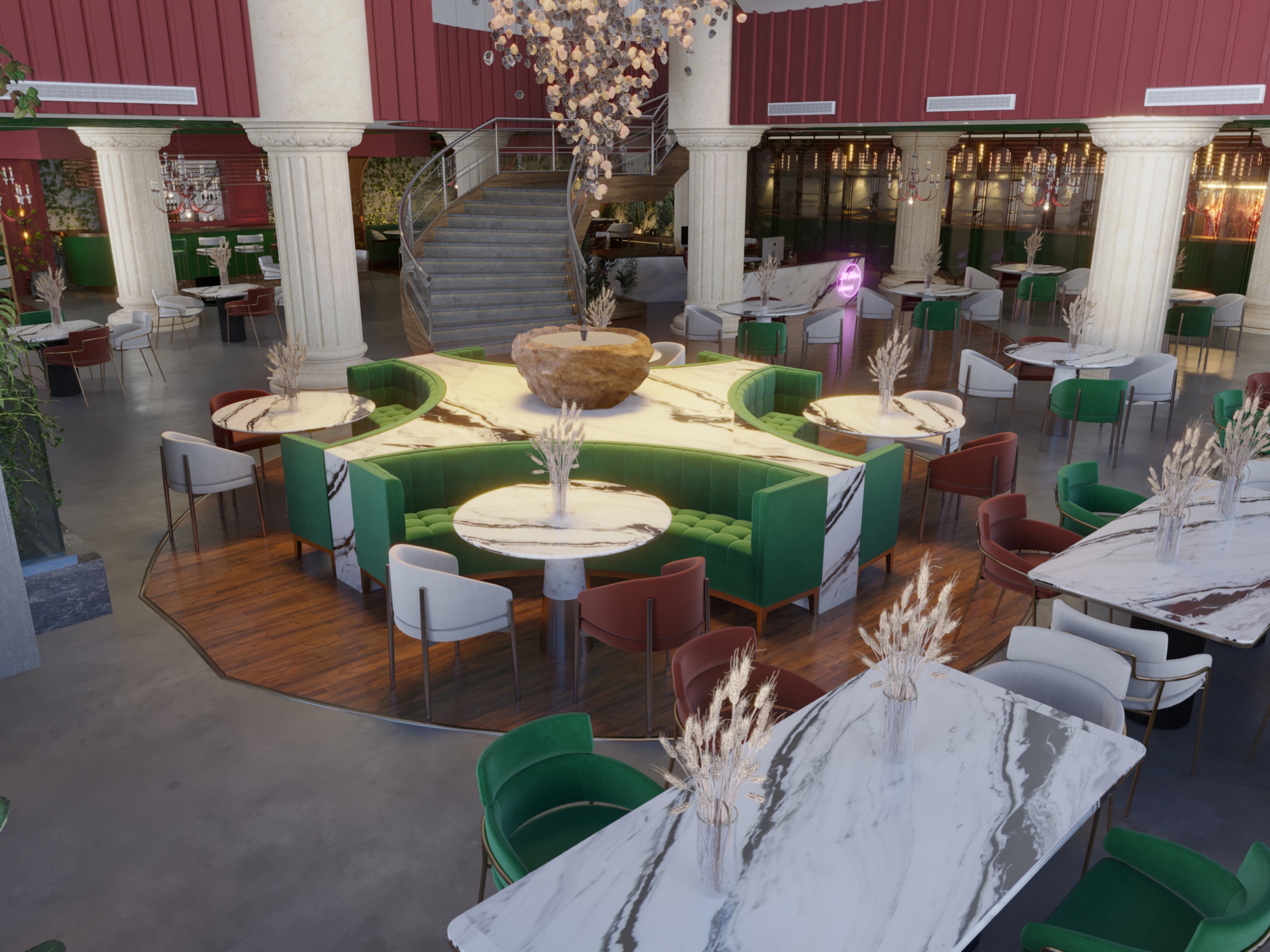
another shot to the x shape marble , however it look luxurious ,also the furniture around it fit perfectly .
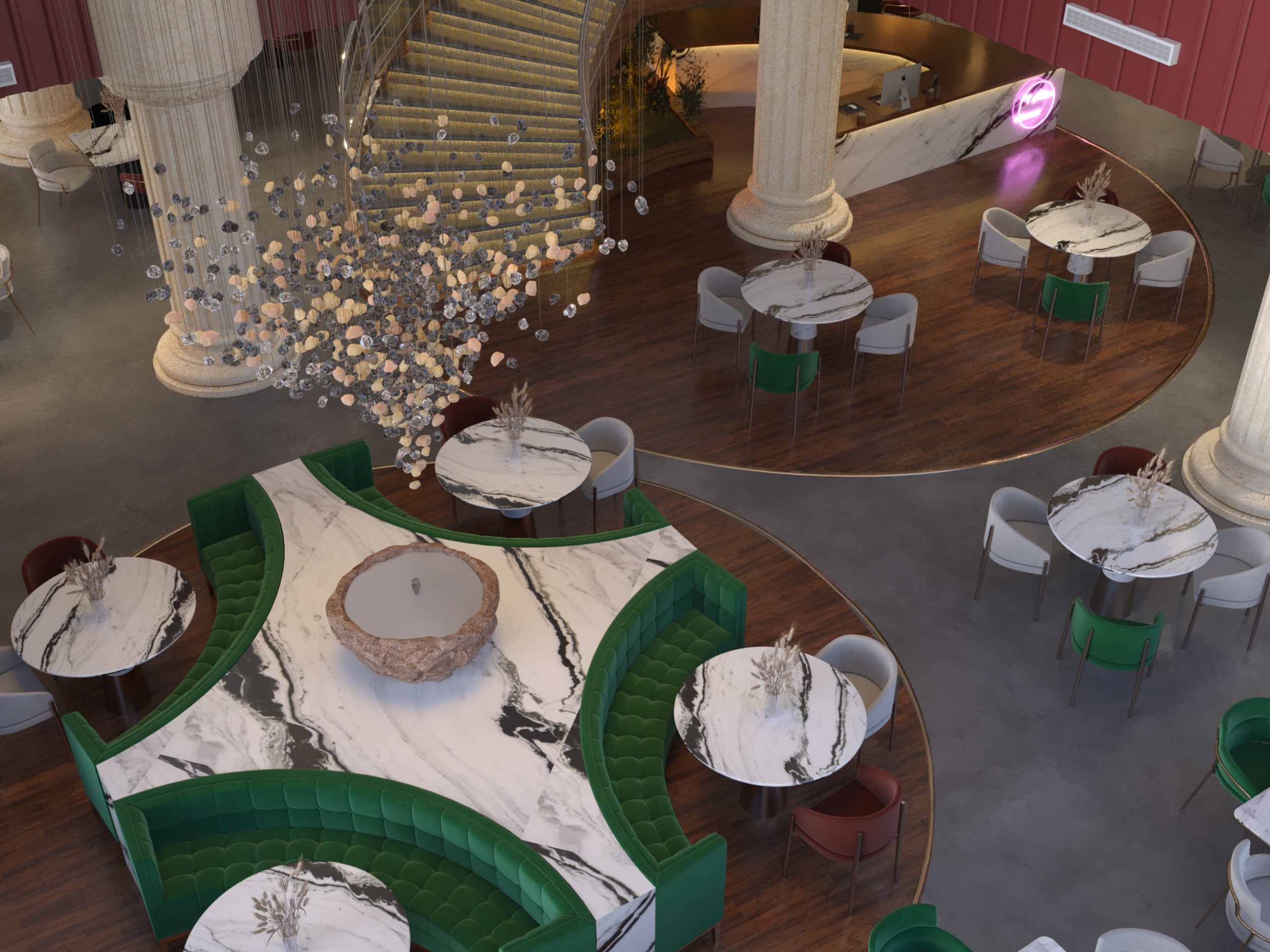
x shape marble from a top view , also it show the nice idea about the chandelier and the stone pot .
IN CONCLUSION :
ITS SEEMS HARD TO DESIGN MAIN HALL WHEN ITS BIG , HOWEVER WHEN YOU TAKE YOUR TIME
AND CLEAR YOUR MIND TO HANDLE THE VACUUM , AS A RESULT YOU WILL COME UP WITH
DESIGN SATISFY YOU AND THE CLIENT .
FOR NEO CLASSIC DESIGNS PRESS >>>> HERE .
VISIT OUR INSTAGRAM PAGE BY PRESSING ON>>>> HRarchZ .
THANK FOR TRUSTING US .

